Before & After: Todoist's All-New Layout
New Todoist Layout
18th Aug, 2024
Todoist has a new look and with that look comes workspaces and calendar on the horizon. Here's a before and after look at Todoist.
Todoist has had a much cleaner upgrade to their look so let's take a quick look at what it used to look like compared to the design that was available just a few days ago.
First thing that has changed with Todoist was themes.
Themes Before
Themes After
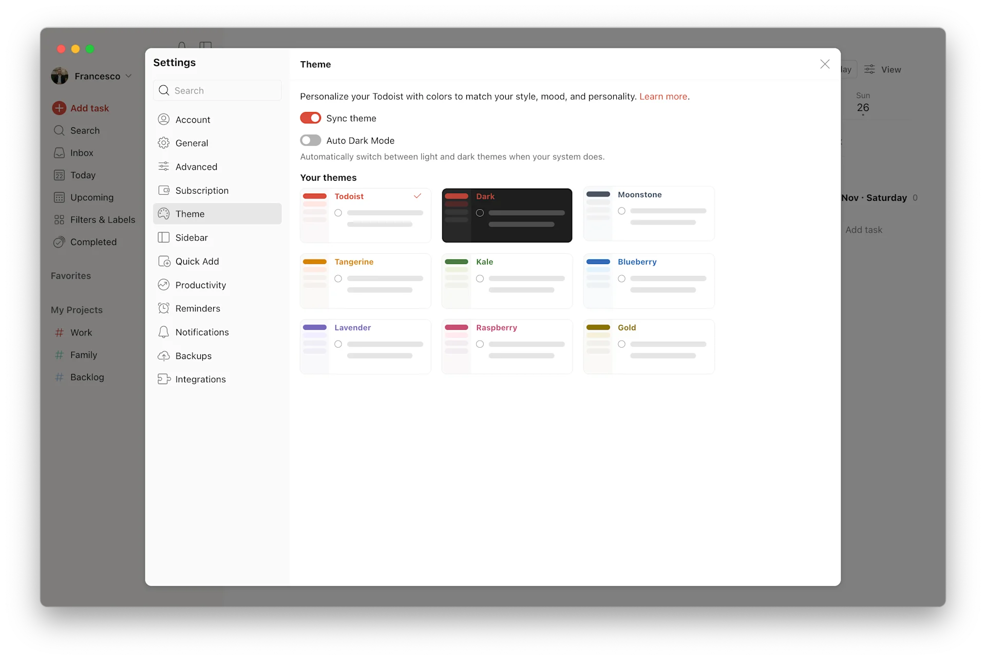
The new approach to themes focuses on less intense colours and more subtle colour introductions. No more top bar colour option but a focus on more simple neutral colours. This is a much needed upgrade and makes the new design pop. New theme colours:
- Todoist Red
- Dark Mode
- Moonstone
- Tangerine
- Kale
- Blueberry
- Lavendar
- Raspberry
- Gold
General Look Before
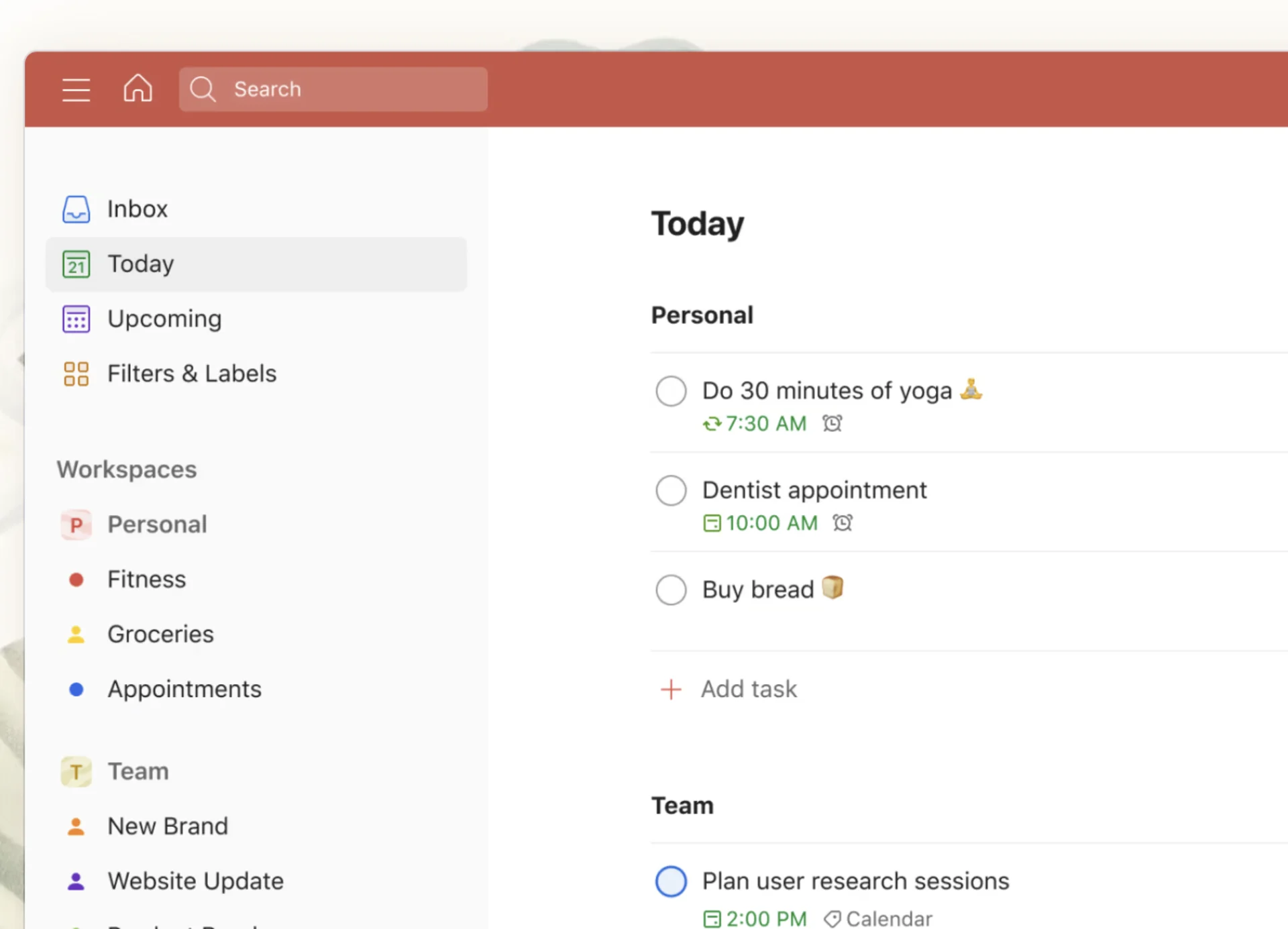
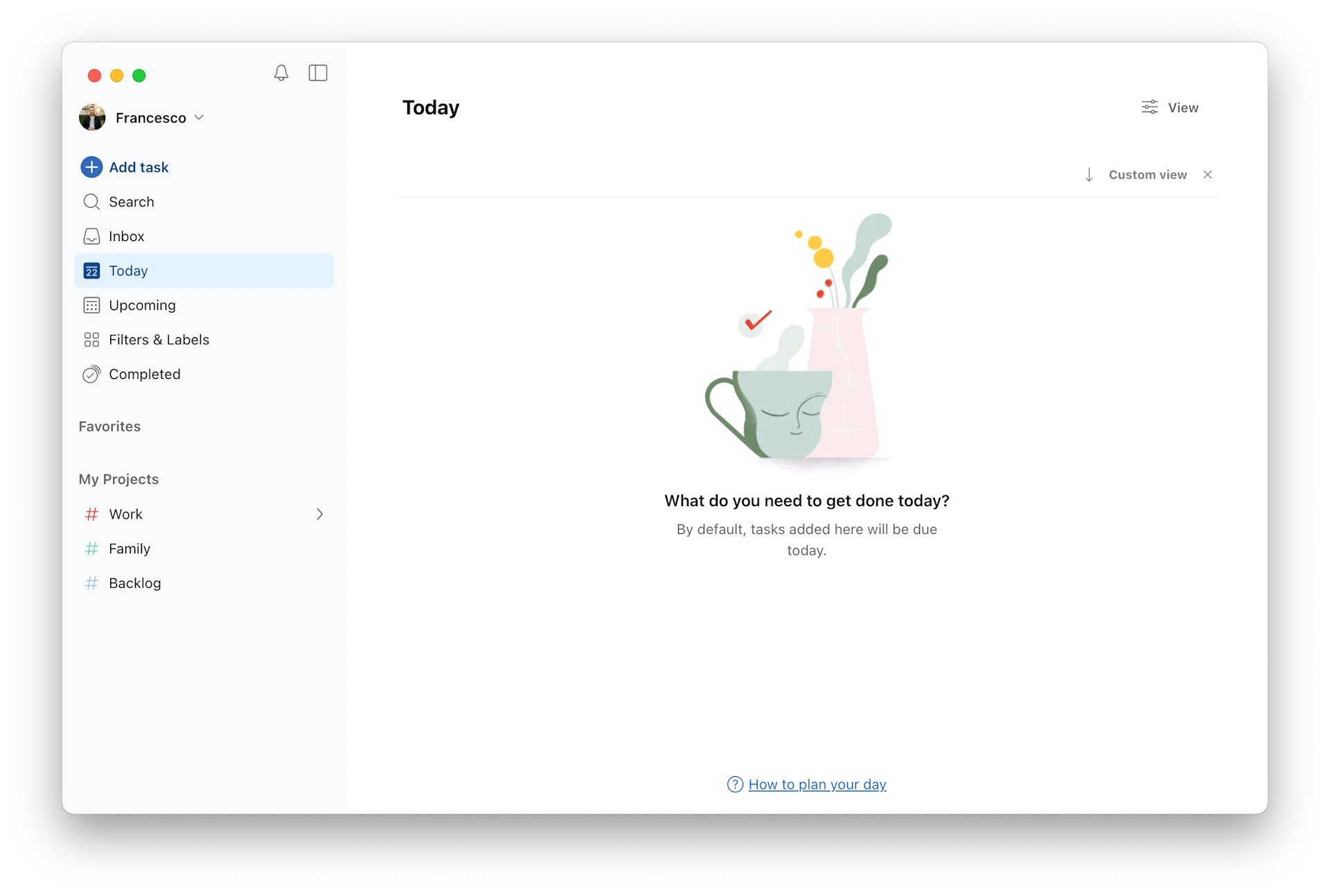
General Look After
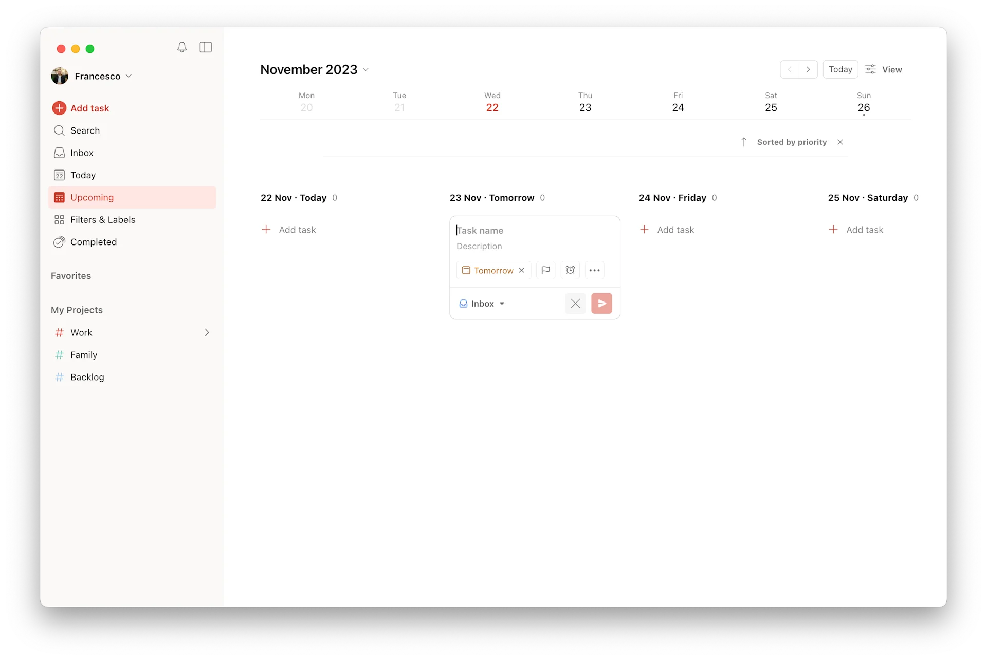
As you can see the change has focused on removing complexity. The search and general sidebar is more practical with a focus on using your space more for tasks than design.
- New workspaces are coming soon
- New calendar view with be nested (coming)
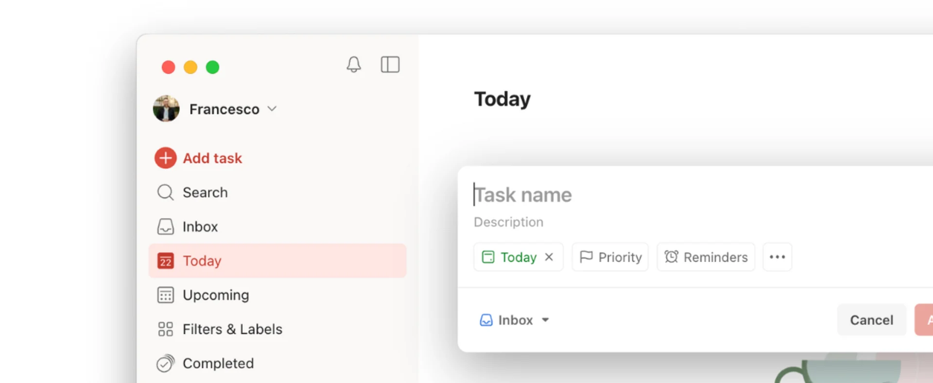
Sidebar Before
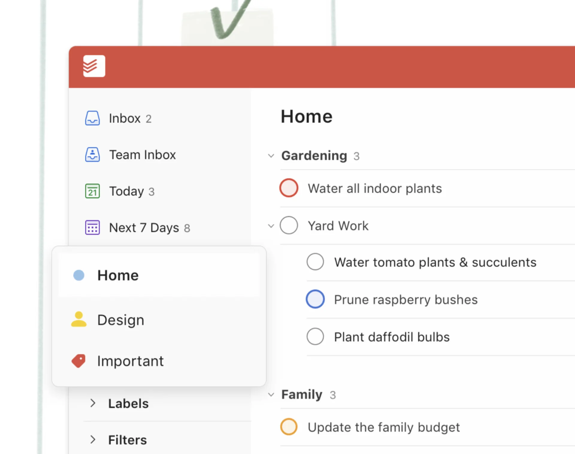
Sidebar After
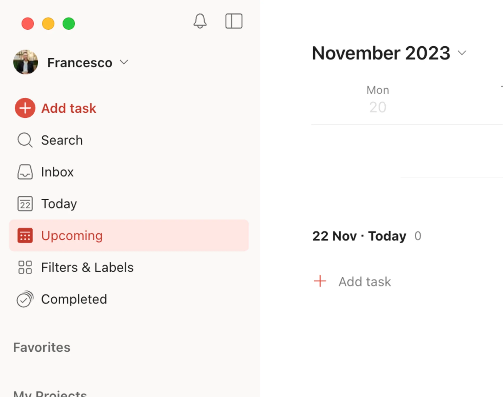
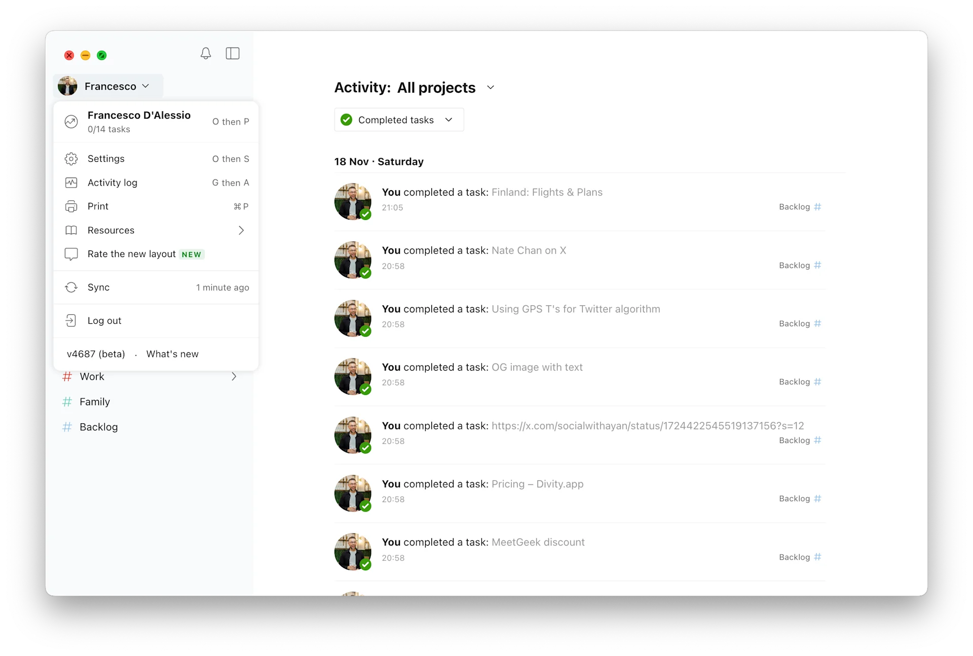
The sidebar has had one of the biggest upgrades, with the new search, better visibility for all other projects and areas as well as a new "add task" ability. Settings is now nested inside of your profile allowing for better access and cleaner look.
Weekly Roundup: Explore People's Productivity Tools
Become a reader to our newsletter exploring what productivity apps people use on a daily basis to get things done