Exclusive Interview: What's Next for Todoist?
Whats Next For Todoist September 2023
18th Aug, 2024

Go further with Todoist in the next 12 months as they plan a slurge of new features, updates and re-thinking of elements of their to-do list application loved by millions.
Doist are the creators of some of the most popular productivity apps on the market. Twist and Todoist have been thriving for many years and helping people work more effectively. Well, Todoist wants to be better with workspaces, feature introductions & much more.
What's Next For Todoist?
This is a special interview we've secured with Brenna, CMO of Doist. A big thank you to her and her team on co-ordinating this piece for us and giving us an exclusive insight.
Hello, introduce your role at Doist & Todoist?
Hi I’m Brenna, the Chief Marketing Officer at Doist. I’ve been with the company since 2011 and have worn many hats over the last decade. In 2021, after many years as Head of Marketing (and after just having my second daughter), I assumed the role of CMO. Today, I help steer Doist with Amir, our founder and CEO, and Gonçalo, our CTO.

I’ll be honest: It has been a challenge to settle into my executive role, as we’ve been navigating some big, company-wide changes and mammoth, all-hands-on-deck type projects. Recently, though, things are stabilizing. I am in the process of building a new, comprehensive brand strategy for Todoist that will help invigorate our brand identity after a few years of being kind of bland and boring, to be frank.
Breathing new life into our beloved brand is a very, very exciting prospect for all of us.
How has Todoist been the last few years?
It has taken us a few years to find our stride with Todoist after the pandemic, growing the company to ~100 people, and having to make some hard decisions about where we prioritize our efforts.
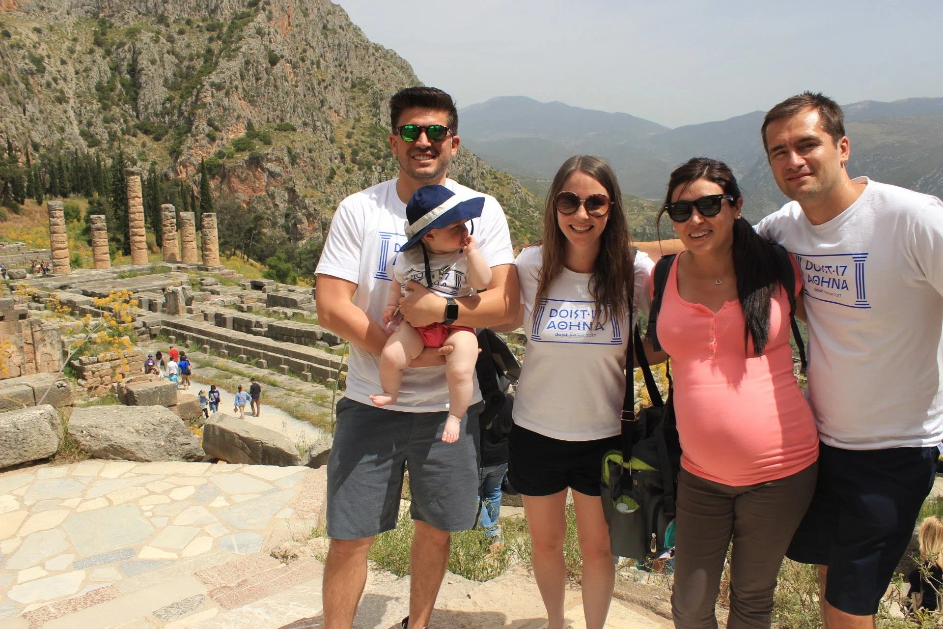
Coming out of the fog of the pandemic to see that async work didn’t take off in a meaningful way forced us to sit down (literally, at our first ever leadership retreat) and decide where to place our bets in order for the company to thrive. We decided to bet on Todoist.
For me, as a leader, those were some of the most difficult decisions I’ve had to make – to pull the plug on some work that I was extremely proud of and could see loads of potential in. But as a fully bootstrapped and independent company, we simply don’t have the financial luxury of plowing tons of resources into things that didn’t contribute tangibly to our business.
The positive result of those difficult decisions, though, is that we’ve shifted our resources to Todoist in a very productive way and are making progress on some huge projects that we wouldn’t have been able to pull off if we had still been dividing our attention across various products/brands.
Our revamped DO System is helping us speed up our shipping cadence and the next few months might just be the most exciting time in Todoist’s history.
What new features are Todoist working on?
This half of the year, we have two main Strategic Priorities which guide new and/or improved feature work for Todoist within our DO System. They are focused on (1) improving collaboration, and (2) simplifying Todoist.
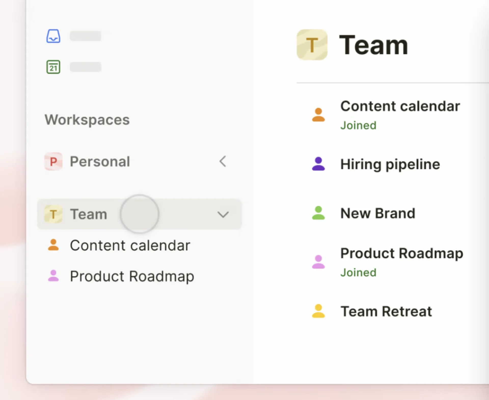
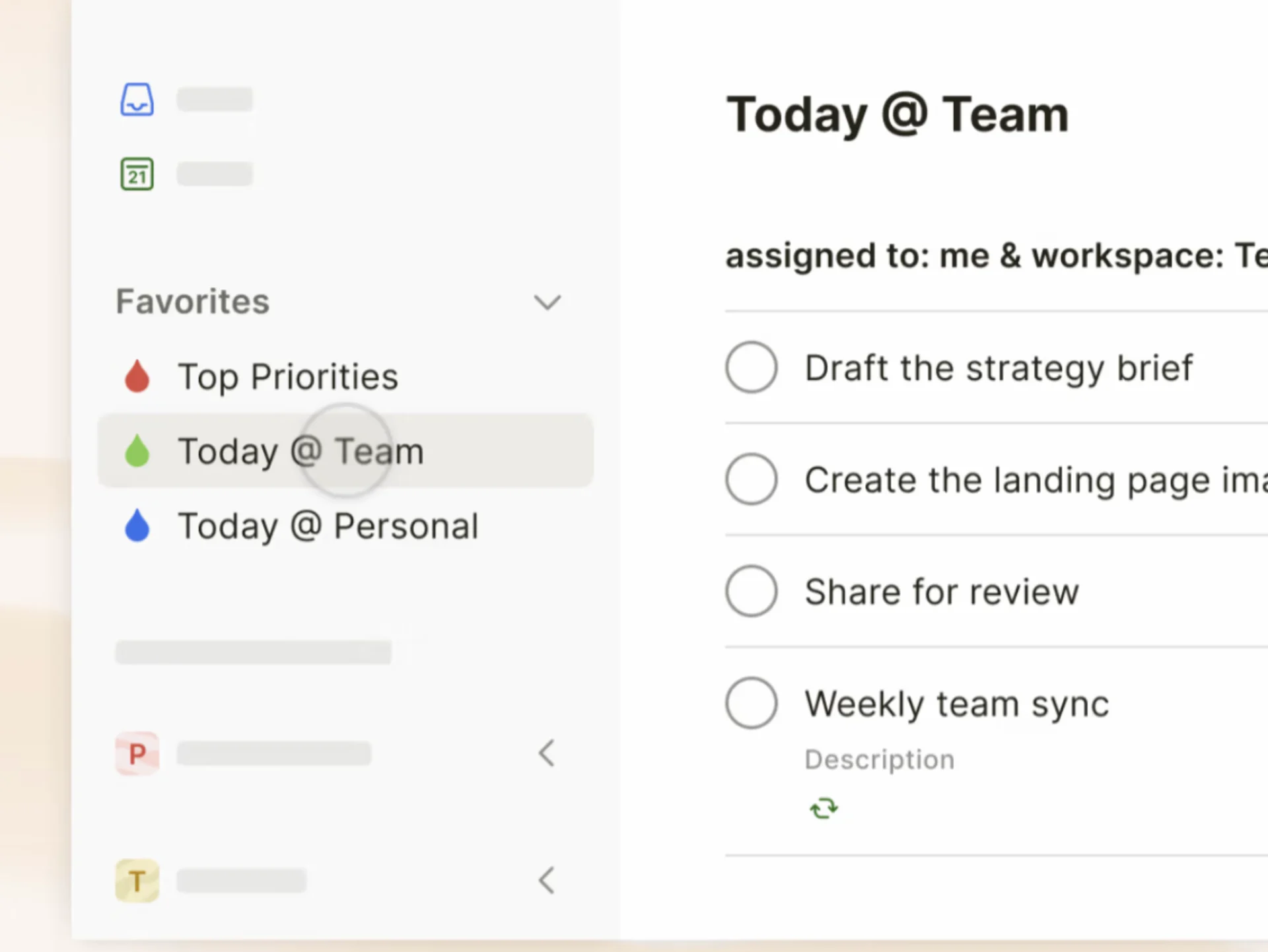
The “improving collaboration” priority includes… a lot of goodies. This is the squad tasked with releasing workspaces to existing Todoist users (insider tip: test workspaces by creating a brand new account) and taking this new collaborative setup in Todoist from zero to one. We had been hoping to release workspaces to existing users in July, but to do that we need to fully deprecate our old projects/tasks sharing architecture. Until we “unplug” all existing users from the old sharing model and migrate them to the new sharing model, existing users won’t be able to move projects between workspaces and that, for us, is a UX dealbreaker.

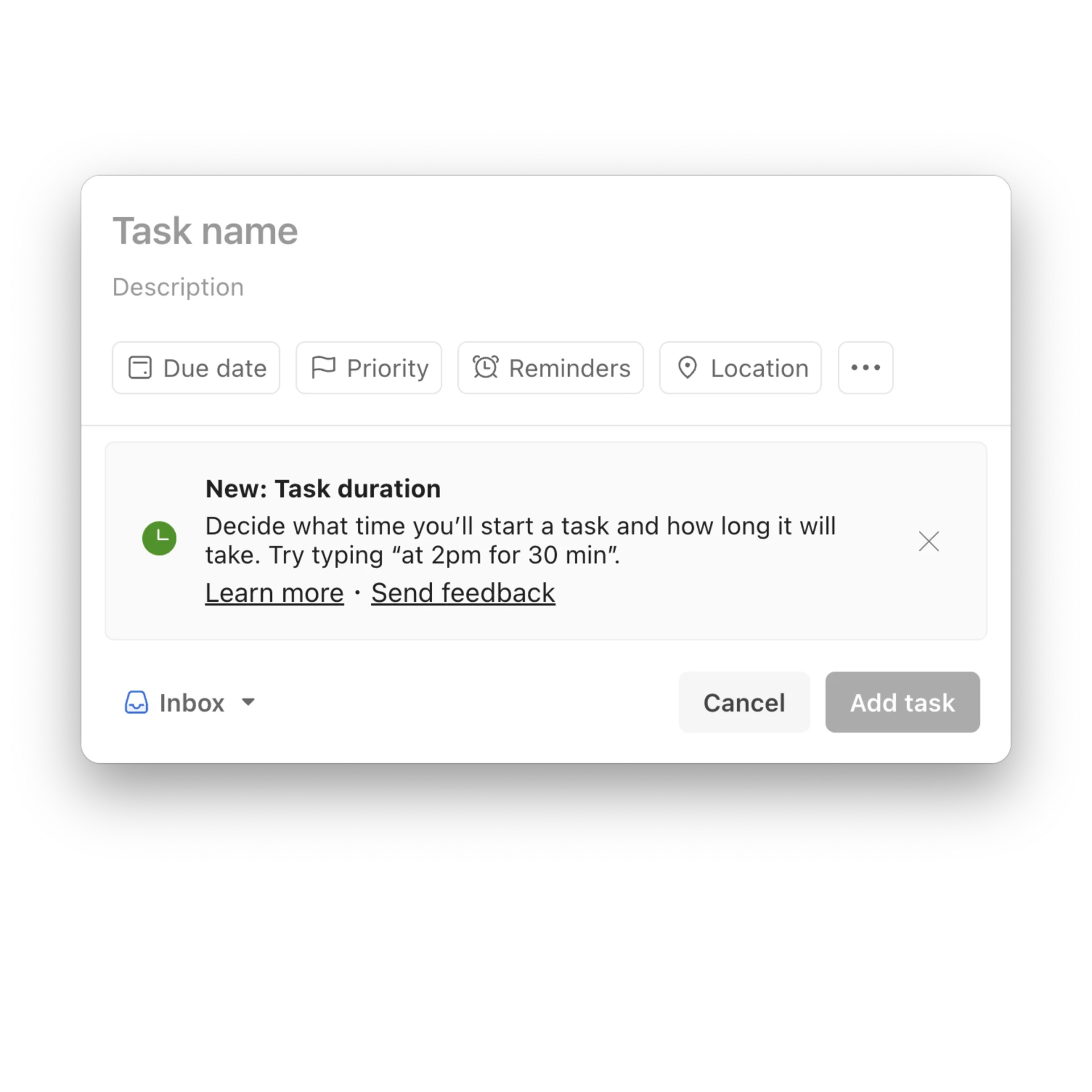
Another squad within this “improving collaboration” priority is tasked with improving how people plan their work together in Todoist. We’re currently in the process of releasing Task Durations, a years-long requested feature and critical technical building block needed to properly build a… drumroll… native calendar view. No firm ETA on the calendar view yet, but I will say that we are already doing some preliminary internal testing.

The “simplifying Todoist” priority has a handful of awesome projects on deck as well. One squad is working on smoothing the Todoist UI around the edges, as it’s been many years since we’ve updated the app’s design (Amir shared a sneak peek here).
There’s a Papercuts squad that will be knocking out some of the most common user-reported annoyances. And my squad, Polish Branding and Marketing, which is, well, polishing our branding and marketing to ensure that both are aligned with the direction Todoist is heading.
How are workspaces coming along in beta?
Workspaces have been in beta since February and in July, we fully enabled workspaces for brand new users. As I mentioned above, the disconnection from the previous sharing model and the connection to the new sharing architecture is momentarily blocking us from releasing workspaces to current users. But when we do, we anticipate things going smoothly. We hope to release workspaces to existing users sometime in October.
So far, feedback has been very positive. In fact, as I was writing the previous paragraph, a snippet of user feedback was piped into Twist via Zapier saying, “Workspaces allow us to better map out which clients need help, and more quickly see what is urgent.” Another recent snippet of feedback was, “I really like how I can see my personal and work workplaces without having to logout and log back in. Game changer!”

We feel that we are on the right track and are extremely optimistic about seeing the value proposition we have envisioned for so many years come to life. When we announced this beta, a lot of Todoist users (/r/todoist, more specifically) were skeptical that we’d pivot 180º into B2B territory, but that is quite literally the opposite of our intention.
Today, productivity apps are either too sparse or too bloated with features: The sparsely-featured apps aren’t robust enough to manage the whole spectrum of your life, and the bloated apps are too complex and enterprise-y for the individual use-case.
The sweet spot between those two extremes is where Todoist will lie. We see each user as a holistic human being, and our goal is to craft a product that allows all those different facets of our lives to coexist in one single, user-friendly UI.
We’re so eager to finish the ever-loving saga of the sharing architecture get workspaces into the hands of everyone.
Oops, undefined is still in development...
Weekly Roundup: Explore People's Productivity Tools
Become a reader to our newsletter exploring what productivity apps people use on a daily basis to get things done